Design System:
Waymate
Project Type
Solo Project
Duration
My Role
Design System

Project Overview
Revisiting Waymate,
This Time as a System
Waymate Design System Rebuild is a self-initiated project that revisits and systemises the visual foundations of the Waymate service I designed a year earlier.
While the original project included a basic style guide, the lack of a structured design system led to inconsistencies across screens—such as unclear colour roles, duplicated button styles, and components that did not scale well as features evolved.
This project focuses on rebuilding Waymate’s design foundations from the ground up, using atomic design principles and Figma Variables, to create a clearer, more consistent, and more maintainable system that communicates function and hierarchy more effectively to users.
Problem Definition
An interface where actions weren’t always obvious.
Reviewing the original Waymate designs revealed several structural issues that limited consistency, clarity, and scalability:
01
Components were not designed for reuse
Many components were created as screen-specific solutions rather than reusable building blocks. This led to duplicated patterns, inconsistent behaviour, and increasing design effort as new screens were added.

02
Button sizes and colours lacked consistency
Buttons varied widely in size, colour, and styling without clear rules. As a result, primary and secondary actions were not visually distinguished, weakening hierarchy and making user actions harder to understand.

03
Colour usage failed to communicate interactivity
Interactive elements and non-interactive components often shared similar colours. This made it difficult for users to quickly recognise what was clickable, reducing clarity and increasing cognitive load.

Design System
From Screens to System,
Designing Consistency
Colour
Semantic Colour System for Functional Clarity
I built the colour system by separating primitives from semantic roles. Primitive colours define the raw palette, while semantic tokens assign meaning based on usage—such as text, icons, surfaces, and borders.
Each semantic role is further structured by function (e.g. default, action, error, warning, success), allowing colours to consistently communicate state and intent across the product. This approach reduced ambiguity in UI decisions and ensured that colours were used to reinforce function rather than decoration.


Typeface
A Structured Typographic Scale with Variables
The type system is organised into headings and body text, with clearly defined font sizes, weights, and line heights for each level.
These typographic styles were registered as Figma Variables, enabling consistent application across components and screens. By standardising typography at the system level, I ensured readability, hierarchy, and ease of maintenance as the product scales

Layout & Spacing
Grid-Based Structure for Visual Consistency
To bring structural consistency across the product, I introduced a grid system that defines how content is aligned and spaced. Spacing values were standardised and reused intentionally, creating a predictable rhythm across screens.

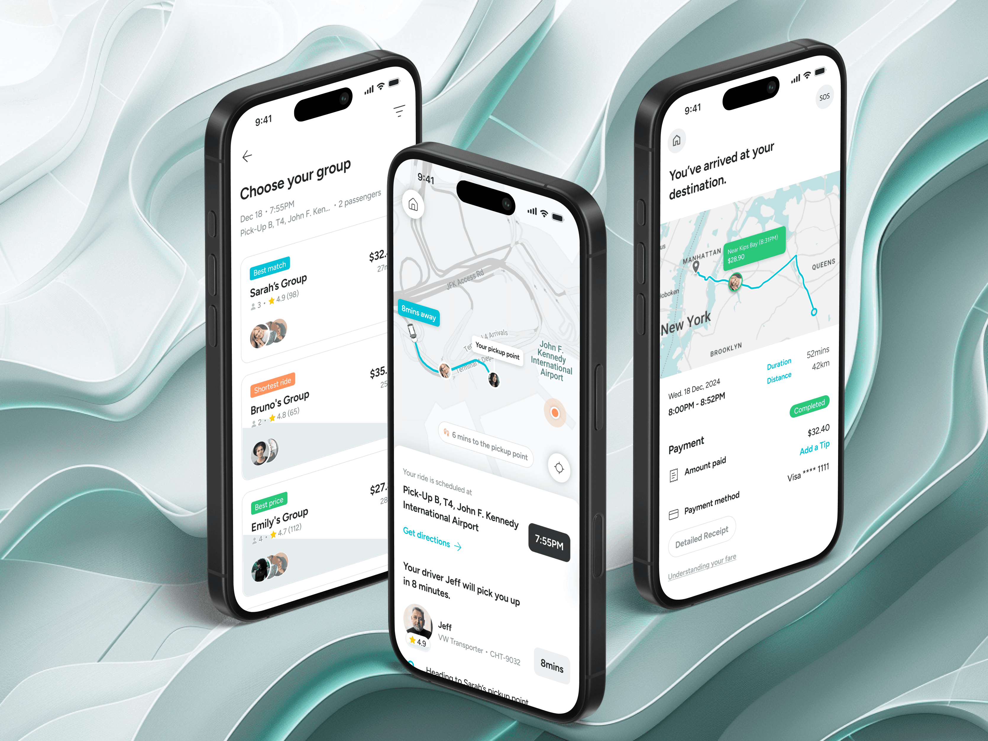
Core Components
Building from Atoms to Composed Patterns
I began with foundational components such as buttons, then expanded the system to include navigation elements, indicators, and form components.
Following an atomic design approach, these components were gradually assembled into more complex patterns, culminating in composed components like cards. This modular structure made components easier to reuse, extend, and combine without introducing inconsistencies or one-off solutions.


Reflections
What I Learned
This project reinforced that design systems are not about visual polish, but about decision-making clarity. I learned the importance of:
01
Defining semantic meaning before visual styling
By assigning clear functional meaning to colours and components first, I was able to use them more intentionally, which significantly improved consistency and made UI decisions easier to scale and maintain.
02
Designing for scale, even in early-stage products
Building a minimal but well-structured design system early on, and allowing it to evolve incrementally, creates a much stronger foundation than trying to retrofit consistency later.
Next Project

Product Designer
Katherine Heo
© 2025 katherine HEO.
LONDON, GMT +0